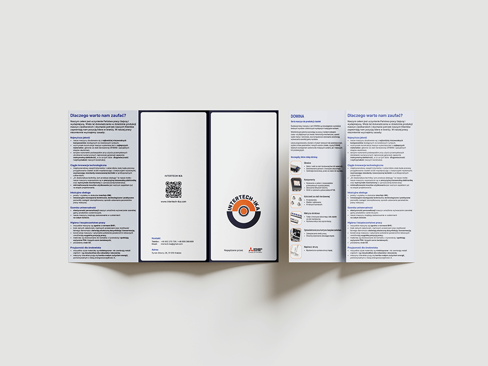
Visual identity, Website & Brochure
INTERTECH-IKA, a company specializing in biscuit production machinery, gave me full creative freedom to refresh its visual identity. The only requirement? The new look had to stay connected to the existing one. My goal was to meet this expectation while creating a fresh, modern, and eye-catching result.
Visual identity elements
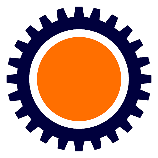
Logo
Inspired by the original logo and the mechanical world, the design hints at machine components while introducing a fresh, modern feel through bold circular elements. The chosen typeface, Industry Ultra, with its strong technical aesthetic, reinforces the brand’s innovative and industrial character.
Logo animation & favicon
Alongside the original logo, I also created a favicon and an animated version for email signatures. I made sure the animation file was lightweight so it works smoothly and loads quickly in emails.
Colour palette
The company’s signature colours were originally blue and orange. I retained them but refined the shades to create a bolder, more modern look. Alongside the primary navy and pumpkin orange, I added a pop of electric blue to inject energy and vibrancy into the brand.
The palette is complemented by secondary colours: cool white, pure white, and black. When creating this colour set, I ensured digital accessibility by selecting shades that provide sufficient contrast, readability, and visual appeal.

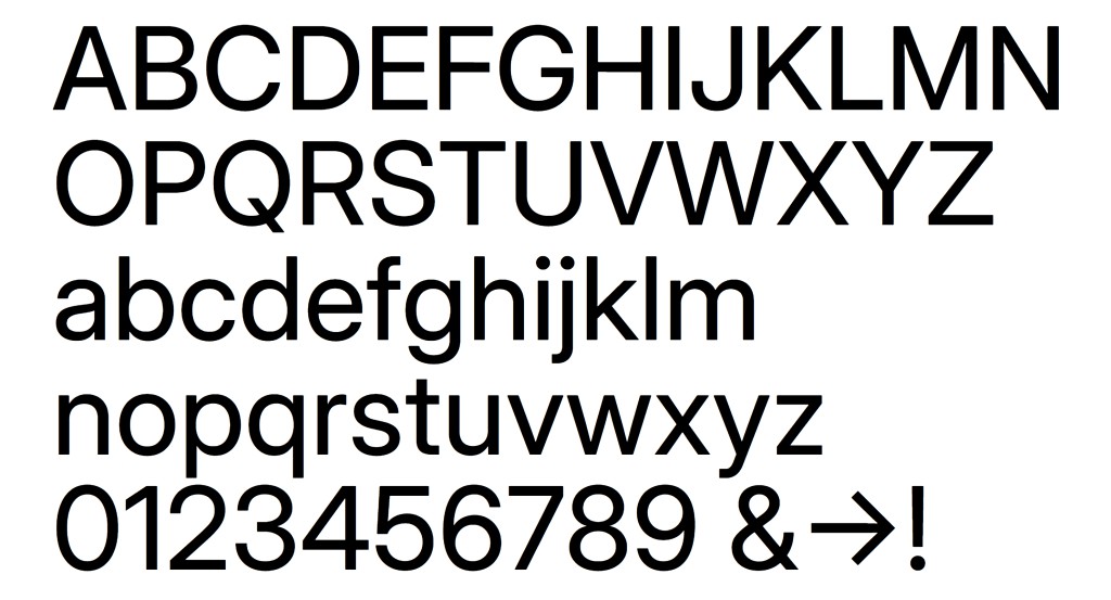
Typography
INTERTECH-IKA’s visual identity is built around the Inter typeface, a freely available font perfect for digital use. Its modern, clean design gives the brand a fresh, contemporary feel and ensures excellent readability on screens. Paired with Industry Ultra, the boldest weight from the Industry family used in the logo, the combination creates a cohesive and striking look that brings character and consistency to the entire visual identity.

Website
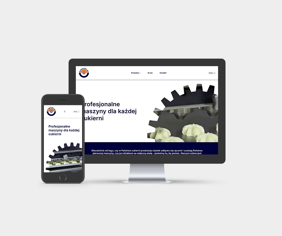
The final stage of the project was a complete website redesign. Building on the old version, I reorganised the content, streamlined the pages, and crafted a clear, intuitive layout that helps visitors find what they need quickly and effortlessly.
